As you may know, there are four types of website layouts: static, liquid, adaptive and responsive. The type of layout users should use for their website depends on their designer’s specific needs and requirements.
Some people prefer to build websites using only a static layout in order to save time and money. Other people prefer using only an adaptive layout in order to add at least some adaptability to their website. Still, others prefer to do a fully responsive website, compatible with any device size, from small mobiles to big desktop screens. It all depends on users’ needs and budget.

Responsive or Adaptive Design
Static layout
A static layout has a fixed width with no adaptability based on the browser width. That means that it is responsive only when scaling content depending on the changes in the size of the viewport. In this case, the whole layout remains static and only changes the size of the elements to show the whole template in one screen. Simply put, static layouts accommodate only the desktop view of a website on a mobile or tablet browser.

Example of Static Layout
Liquid layout
A liquid layout uses percentages instead of pixels, which allows the content of the page to be fluid. Websites began to transition from static to liquid page layouts starting in 2010 and 2011.

Example of Fluid Layout
Adaptive and responsive layout
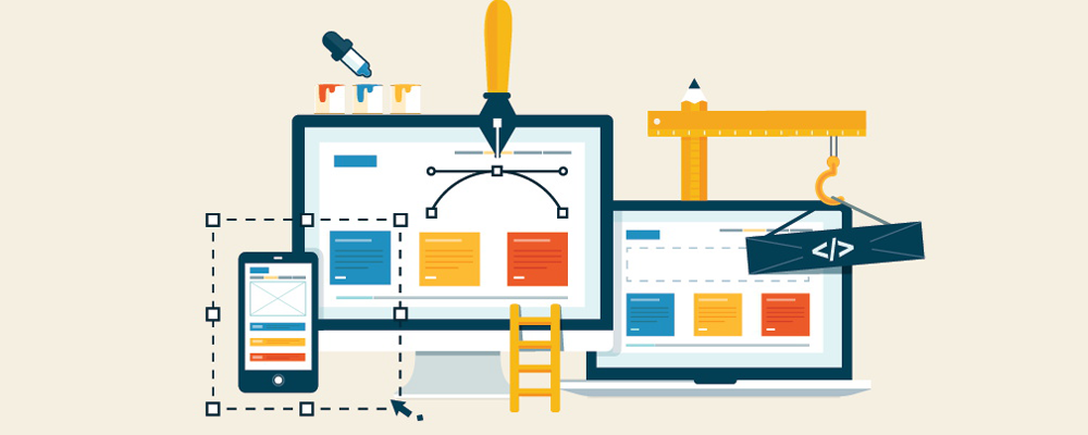
In this article, we will be talking about modern and popular approaches to website development, like adaptive and responsive layouts and the difference between the two. We will be talking about which approach is better, adaptive or responsive, and the advantages and disadvantages they both have.

Adaptive and Responsive Layout
Adaptive layout
First, let’s talk about an adaptive layout and what that means. An adaptive layout uses a web technology called CSS media queries, which adapts to the screen resolution (e.g. mobile, tablet or desktop). Media queries automatically understand the width of the browser and make changes to the layout depending on the screen size. In this case, an adaptive layout only uses pixels, like a static layout, but uses multiple fixed layouts for different screen resolutions.
Let’s show some examples of media queries in an adaptive page layout. If the browser is 600px wide, the main container of the page should have a width of 300px. If the browser has a width of 1100px, the main container should have a width of 500px. If the browser has a width of 1600px, the main container should have a width of 960px.
Another example can be shown with a changing background color for different resolutions. If the browser has a width of 600px, the background color will be red. If the browser has a width of 1600, the background color will be green.
Depending on the type of website and the number of elements it has, content can be changed in different ways for different resolutions. For example, elements can be swapped or removed, and colors and sizes of elements can be changed for different screen widths.

Example of CSS Media Queries in Adaptive Layout
This kind of adaptive page layout requires less development time than a responsive page layout. Often if a website only has one static version for the desktop and requires support for mobile or tablet versions, an adaptive layout can be used. Using an adaptive layout will create additional mobile or tablet versions for specific device sizes.

Desktop Version

Tablet Version

Mobile Version
Adaptive page layouts are definitely very effective if users only want to support multiple devices and screen resolutions for their website, because adaptive layouts won’t create fully responsive websites that fit perfectly for every device size. An adaptive page layout will create only fixed website versions for selected screen resolutions; not all screen resolutions will display the website perfectly.
The main disadvantage of this kind of adaptive layout is that on some screen resolutions, there will be too much or not enough space between the main container and the edges of the browser.
Responsive layout
A responsive layout is the most complex and most effective approach towards creating websites that will fit perfectly on devices of any size. This approach is a mix between adaptive and fluid page layouts and uses break points of an adaptive layout and relative units of a fluid layout.
Usually, the development of a responsive design begins with the mobile version in order to fit all possible elements on a small screen.

Example of CSS Media Queries in Responsive Layout

Responsive – first example, Adaptive – second example
Conclusion
In conclusion, users should select the layout type that best suits the needs of their website. The choice depends on users’ preferences, the complexity of their website and their budget. To attract the largest number of visitors to the website, I suggest using a responsive layout, because it will fit perfectly and is supported by all device sizes.